Vox Health
Brand identity, design system, and website — zero to launch in under two weeks.
The Brief
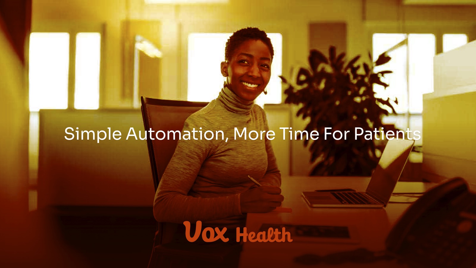
Vox Health came to TSH with a clear mission but no visual language to match it. The company had built something genuinely useful — an AI platform that automates the phone calls, scheduling, insurance verification, and follow-up workflows that quietly drain dental practices of time and money. Their product reduces no-shows by 42%, cuts admin overhead by 60%, and improves collections by 24%. The technology was real. The brand was not.
Their CEO came to us with nothing more than a vision: build a brand that communicates trust, intelligence, and clarity in a space — healthcare AI — that is easy to get wrong. No logo. No colors. No existing visual direction. Just a product that deserved to look like it belonged in the same room as the problem it was solving.
The Challenge
Dental AI is a crowded and skeptical space. Dental practices are typically risk-averse buyers. The brand needed to accomplish two things simultaneously that often work against each other.
Feel Human
Healthcare is inherently personal. A brand that leads too hard with "AI" risks feeling cold, clinical, or threatening to the care teams it's designed to assist.
Feel Credible
A SaaS platform targeting DSOs (Dental Service Organizations) and multi-practice groups needs to signal enterprise-grade seriousness — HIPAA compliance, SOC 2 certification, deep PMS integrations with Dentrix, Eaglesoft, and Open Dental. It can't look like a startup side project.
A brand that is modern without being sterile, intelligent without being impersonal.
Our Approach
Understand before designing.
We assigned a senior designer to the engagement from day one. No handoffs, no junior proxies — the person running the discovery call was the same person building the brand. The first step was a structured discovery session with the founder. We weren't there to collect a mood board. We were there to understand the strategic ambition of the company: Who is the buyer? What does success look like for a dental practice in year one? What does Vox Health believe about the relationship between technology and patient care? One thing emerged clearly: Vox Health's core belief is that technology should enhance the human connection in healthcare, not replace it. That became the conceptual spine of every design decision that followed.
Three directions. Three points of view.
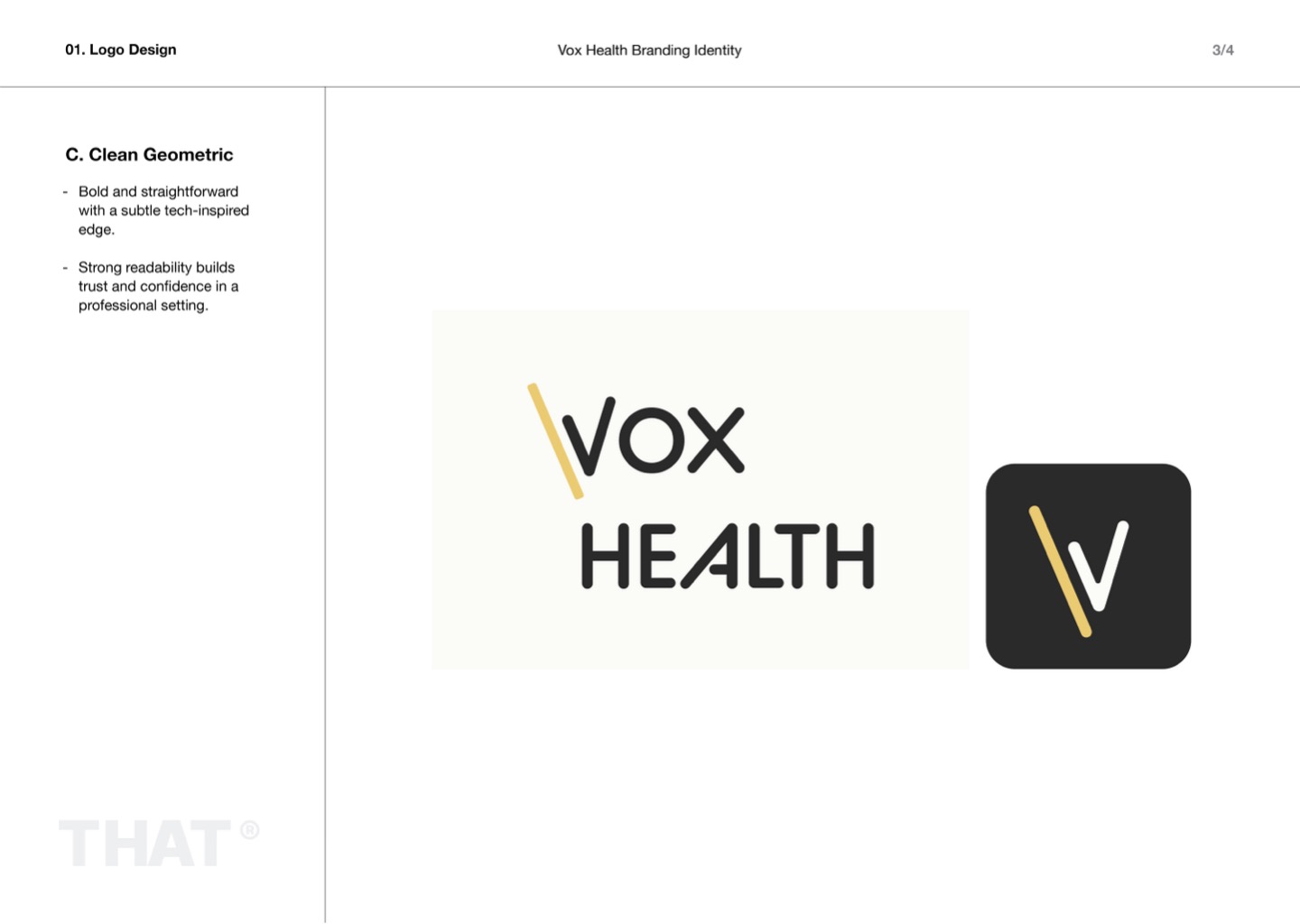
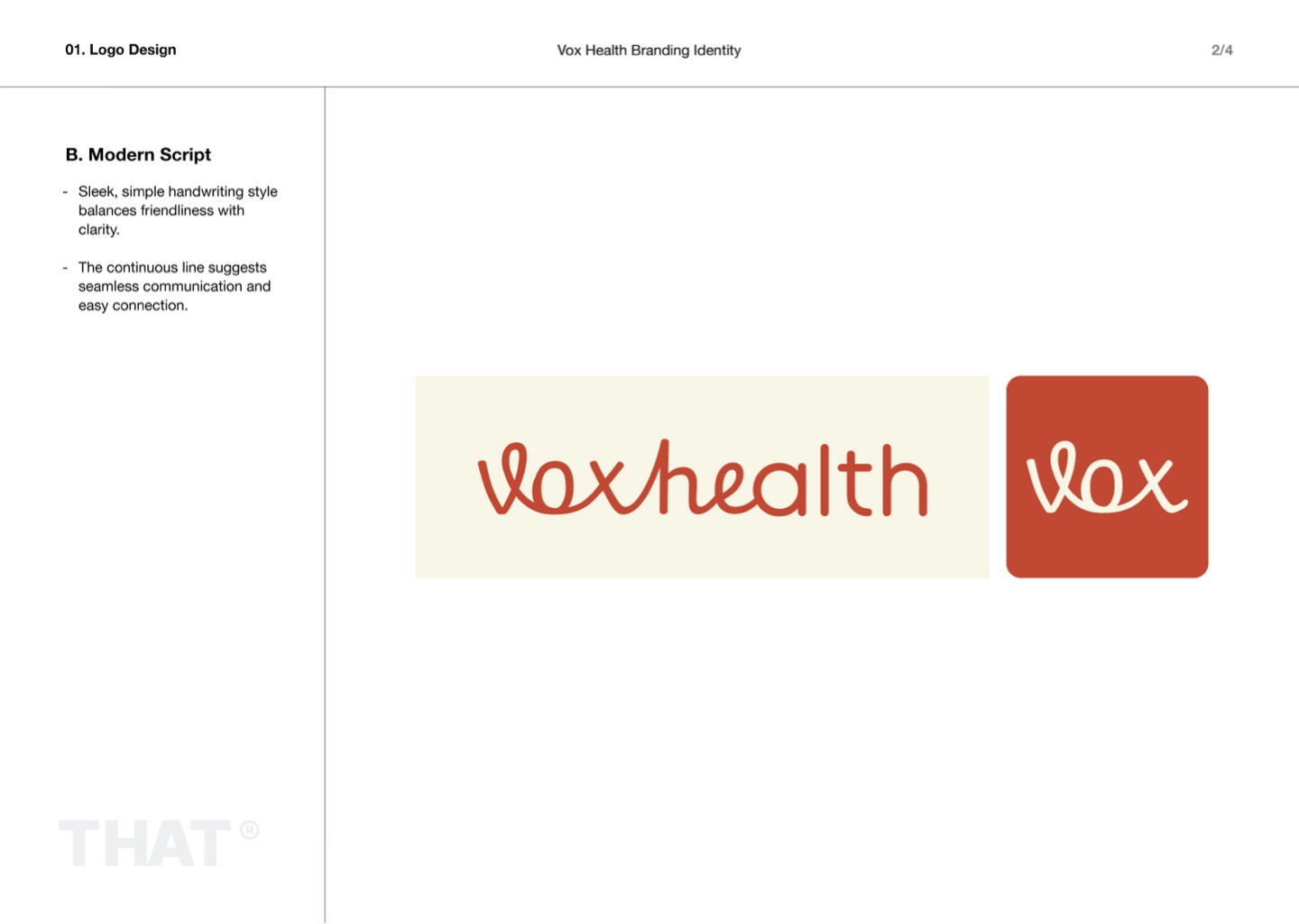
With the strategy anchored, we moved into rapid ideation. Within days, we had developed multiple distinct brand directions — each one a coherent system, not just a logo sketch. Every direction had a point of view: Direction A was clean, geometric, enterprise-forward — built for the CFO making a software decision. Direction B was warmer, more approachable, human-centered — built for the front desk coordinator who uses the product every day. Direction C was a synthesis — professional enough to close the enterprise deal, human enough to earn daily trust. We presented all directions to the founder without editorializing. Our job at this stage was to show, not sell.
Test where it actually lives.
The founder narrowed the field to two directions. From there, the process became surgical. We tested the leading candidates across the real surfaces where the brand would live — the website header, the platform UI, email signatures, and mobile. A logo that looks great in a PDF can collapse in a browser at 14px. We caught those failure points in the refinement stage, not in production. After a second round of feedback and final iteration, one direction emerged as clearly right. Not a compromise — a clear winner that both the founder and the design team believed in.
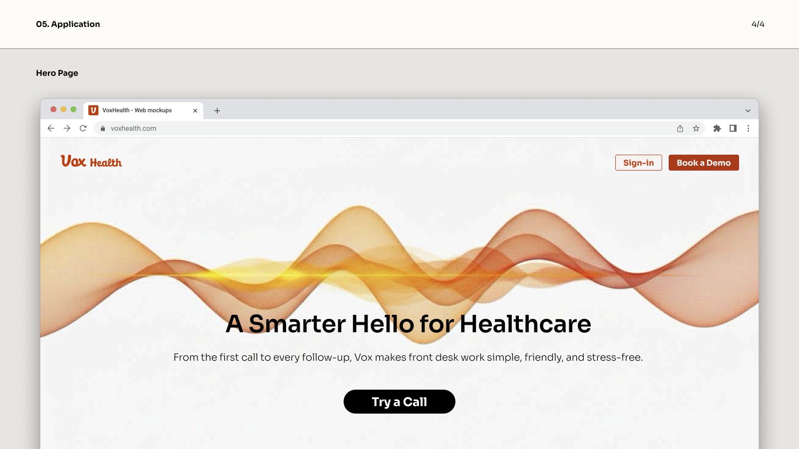
The Result
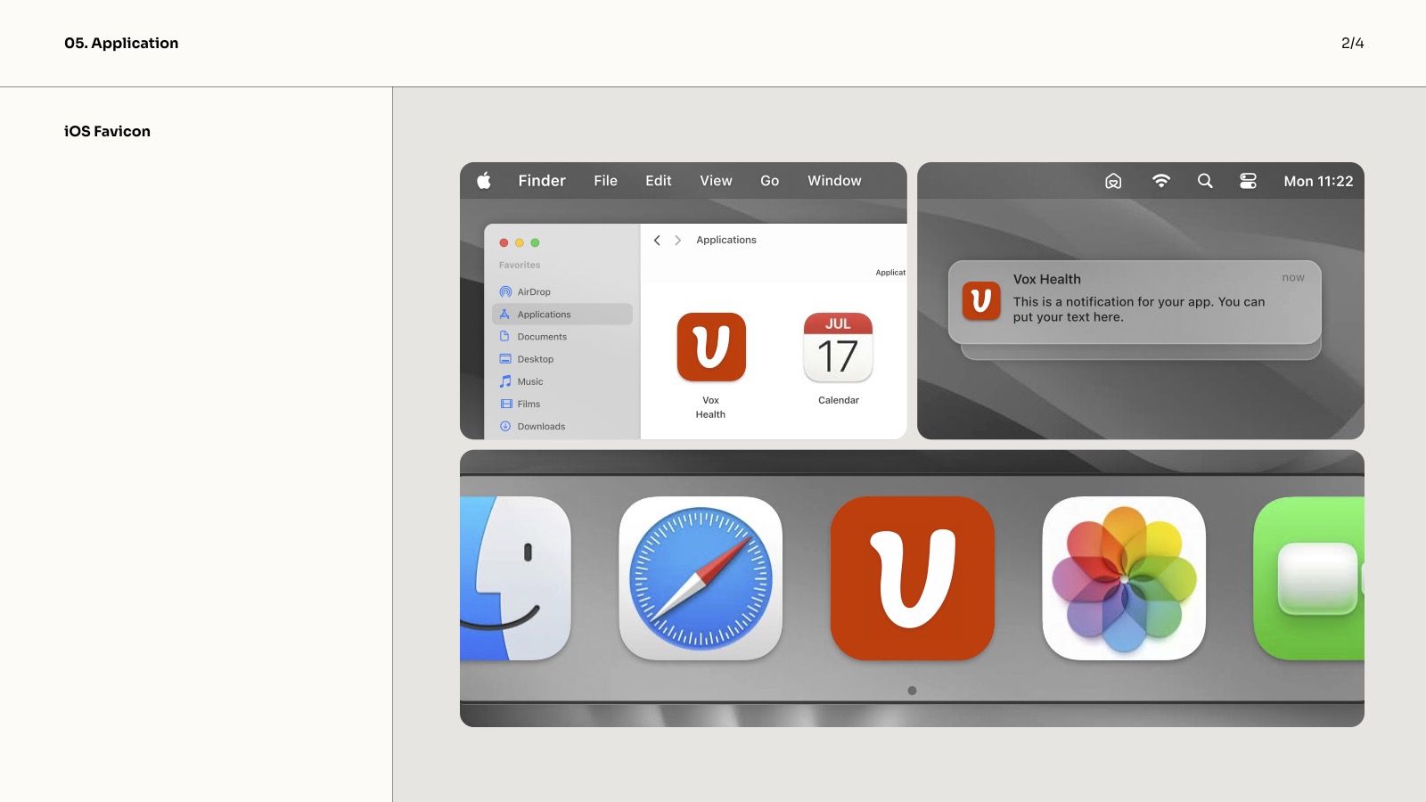
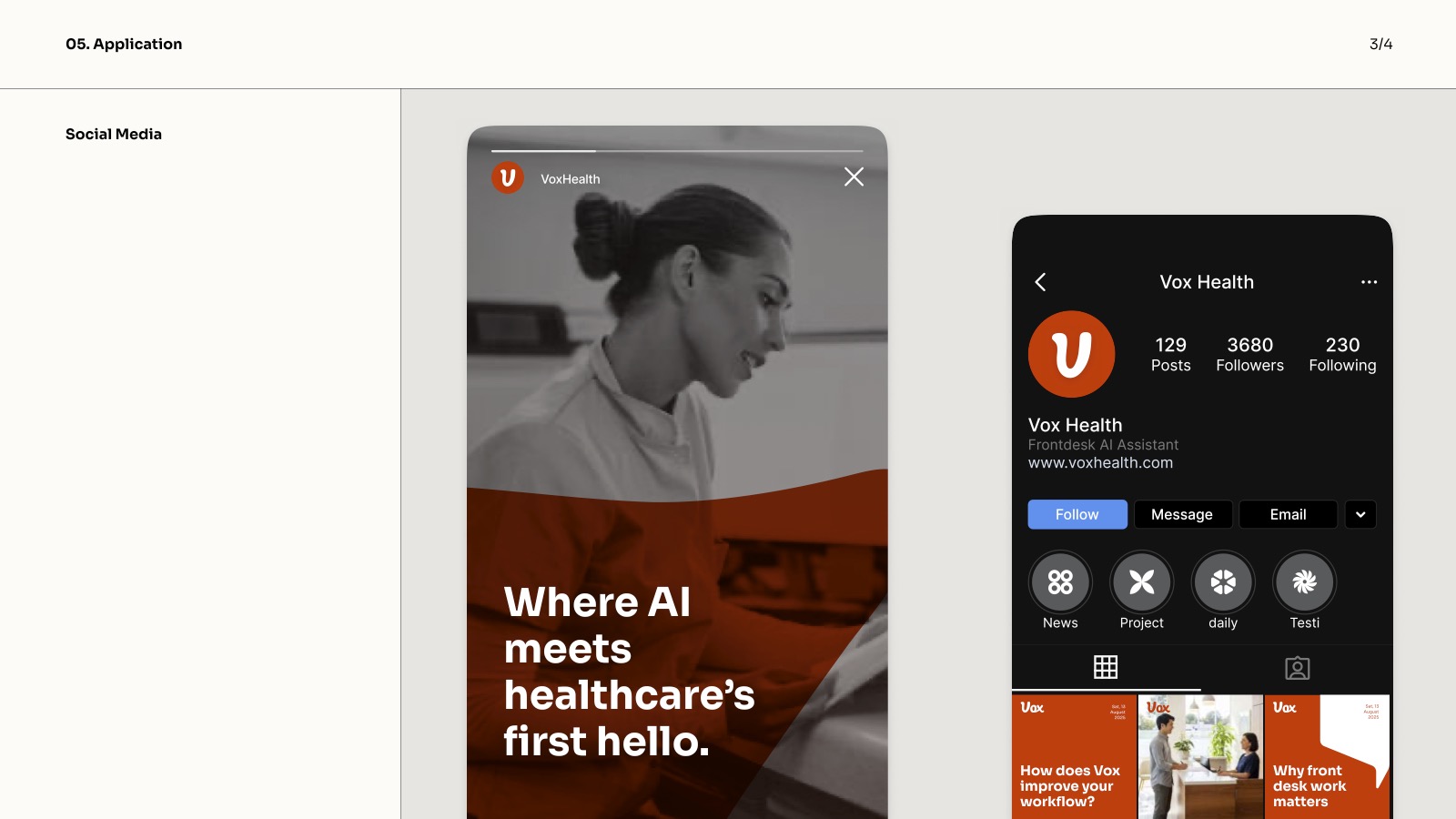
The final Vox Health brand is a system, not just a logo. Built to scale from a browser favicon to a conference banner.
That Software House understood my requirements and their designer was able to translate that into beautiful designs. Extremely professional with high quality.
What we delivered
Ready to build?
Your project could be next.
We keep 2 slots open per quarter for engagements like this. Senior team, no junior proxies, no radio silence. If you need something built right — let's talk.